The Peninsular Company / Visual identity
Good ideas.
Put to work.
A solid green block, a clear name, and a practical point of view. A Michigan identity for independent ventures and useful work.
Download the brand kit
Clear in its purpose.
Make the company clear. Show the work. Give every element a useful role.
Grounded in its place.
Limestone, pine, brick, and lake. Michigan’s material warmth and open space.
Considered in its details.
Steady type, open space, and a few useful elements, used consistently.
01 / Identity
A name with room to breathe.
A solid green block gives the name a quiet, recognizable anchor. The optically spaced wordmark carries the character. At a larger scale, the block becomes the field holding the name.
Stacked wordmark / Full color
- Clear spaceLeave half the block's width on every side. Give the name a quiet background.
- Minimum sizeStacked: 160 px wide. Horizontal: 180 px. Below that, use the icon.
- ContrastFull color on paper or white. Use the white version on pine, ink, or a dark photograph.
- Keep it intactUse the supplied artwork. Keep its proportions, spacing, and colors.
One mark, from large to small

A little more room for a circle

The profile version is optically centered and inset, so all four corners of the block stay visible in a circular crop.
02 / Color & type
Warm ground. Clear contrast.
Limestone and ink do most of the work. Pine identifies the company. Brick brings warmth to one strong field; lake gives a quieter composition room. Use one accent at a time.
Limestone
#F1EEE6The primary ground.
Ink
#1B2926Type and structure.
Pine
#234B40The signature.
Brick
#C45136A single warm field.
Lake
#BCCDCBRoom and quiet.
For reading: ink on limestone or lake, limestone on pine, and #5E665F for secondary text on limestone. Use brick for large graphics; captions on brick use white. Print colors require a stock-specific proof.
Archivo / Display
Archivo supplies the headlines and the outlined wordmark. Inter Tight handles reading and labels. Use weights 570–620 for display and 400–500 for text. The wordmark is optically spaced artwork at weight 650 and width 94.
Both families use the SIL Open Font License: Archivo and Inter Tight. Helvetica Neue, Helvetica, and Arial are the fallbacks.
- Display / Archivo 620
Good ideas. Put to work.
- Reading / Inter Tight 400
A company in Detroit, Michigan, building independent ventures and helping businesses work better.
- Labels / Inter Tight 500
Detroit, Michigan · The Peninsular Company
03 / A sense of place
The view from here.
The place is present in the structure: Michigan Modern’s economy, the Guardian’s material warmth, the Penobscot’s clear silhouette, the Mackinac Bridge’s sense of connection, and the open space of Lake Michigan.
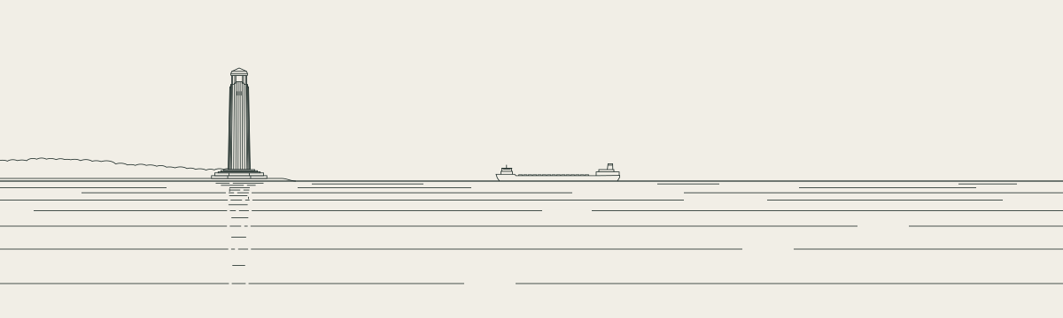

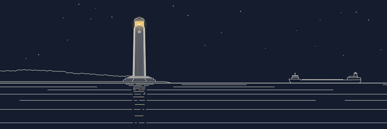
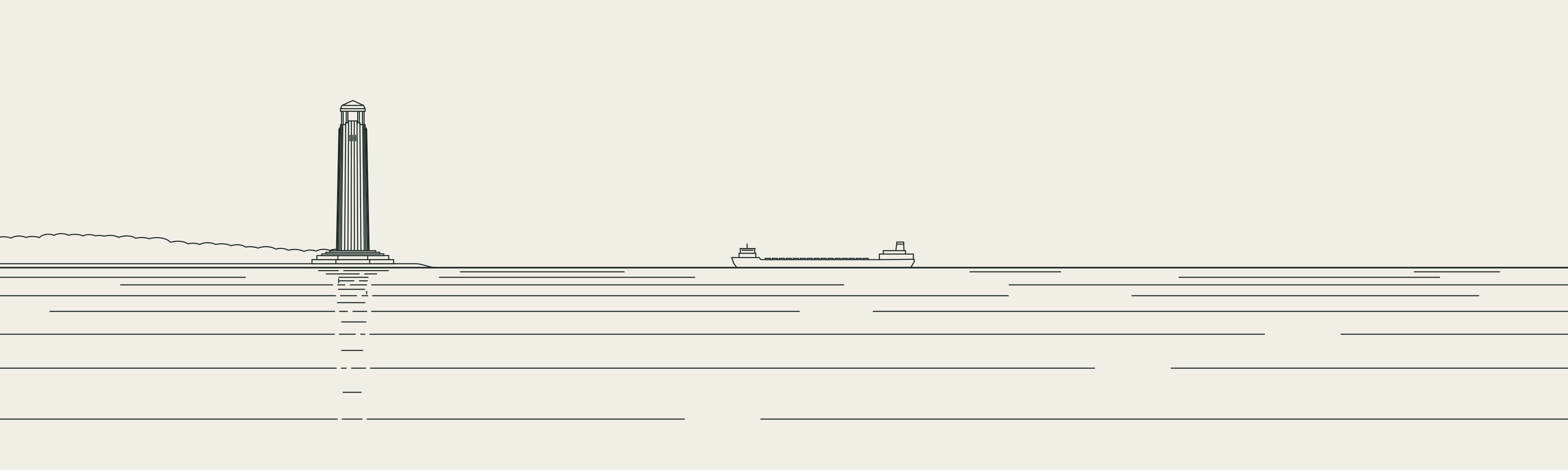
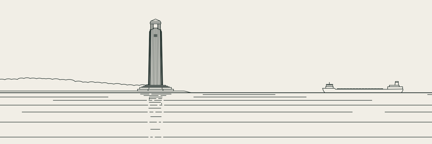
The original Belle Isle drawing remains the companion illustration: Livingstone Lighthouse, a freighter, and open water. Keep it wide, on covers or quiet transitions. The block and wordmark stand on their own at smaller sizes.
04 / In use
Made for the everyday.
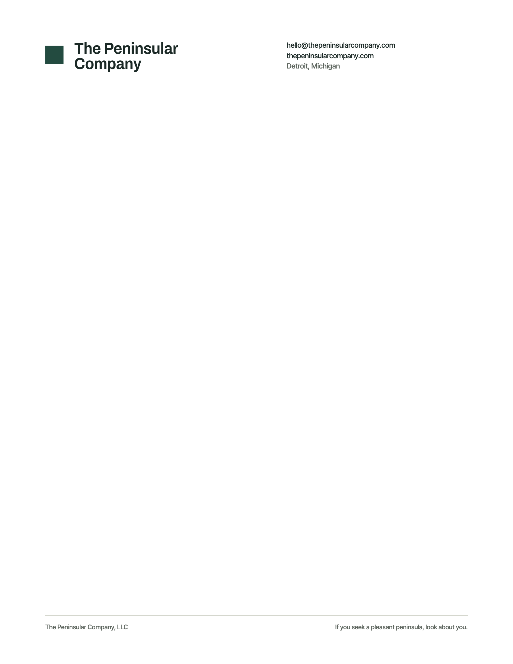
The same spacing, colors, and proportions carry into a letter, an email, or a profile. Each file below uses the current identity.
Joe Lint
Principal

hello@thepeninsularcompany.com
thepeninsularcompany.com
Detroit, Michigan
05 / The system
A small set of decisions, carried through.
Clear margins, square edges, and the same solid block. The parent company stays recognizable while each venture keeps its own identity.
The voice
Say what helps.
Show what is real.
“We get to know your business. Then we build what helps.”
Plain words, specific work, and accurate credit. Lead with what changes for the customer. Keep client and venture identities intact.
Reference points: Cranbrook’s Michigan Modern, the Guardian Building, the Mackinac Bridge, and Knoll’s graphic history. The compositions are original; historic artwork is not reproduced.
06 / Files
The working files.
SVG and PDF keep the logos sharp at any size. Logo PNG files have transparent backgrounds. The full kit includes the reversed and single-color versions.
| Asset | Formats | Use |
|---|---|---|
| Stacked wordmark | Opening pages, documents, larger placements. | |
| Horizontal signature | Headers, email, compact placements. | |
| Square icon | Favicons, listings, billing profiles. | |
| Profile avatar | Social profiles and circular crops. | |
| Lake illustration | Covers and wide compositions. | |
| Social covers | Sized for the supplied profile formats. | |
| Letterhead | 8.5 × 11 in. PNG at 200 dpi. | |
| Email signature | Company-only and named versions. | |
| Business card | 3.5 × 2 in, no bleed. Proof before production. | |
| Identity standard | Idea, voice, marks, colors, type, and use. | |
| Company cover | 1500 × 500 px, with name and symbol. |







The complete identity: six wordmark variants, icons, covers, original lake illustrations, stationery, source vectors, and the six-page identity standard.
Download all files